My Website (Case Study)

I enjoy keeping personal projects moving and when I get time I like to play with new and different technologies, when I run out of ideas I end-up falling back to just rebuilding my website which has had a number of iterations over the years as it is a fun and reasonably easy way to play around with some new technologies and reconsider the design.
I always find design much more challenging aspect and usually find it hard to come up with a new and interesting idea, largely I just shop around and see what I like and try to implement it with my own twist and that is what I did for my last iteration which still looks quite nice and provides a good landing site for me.

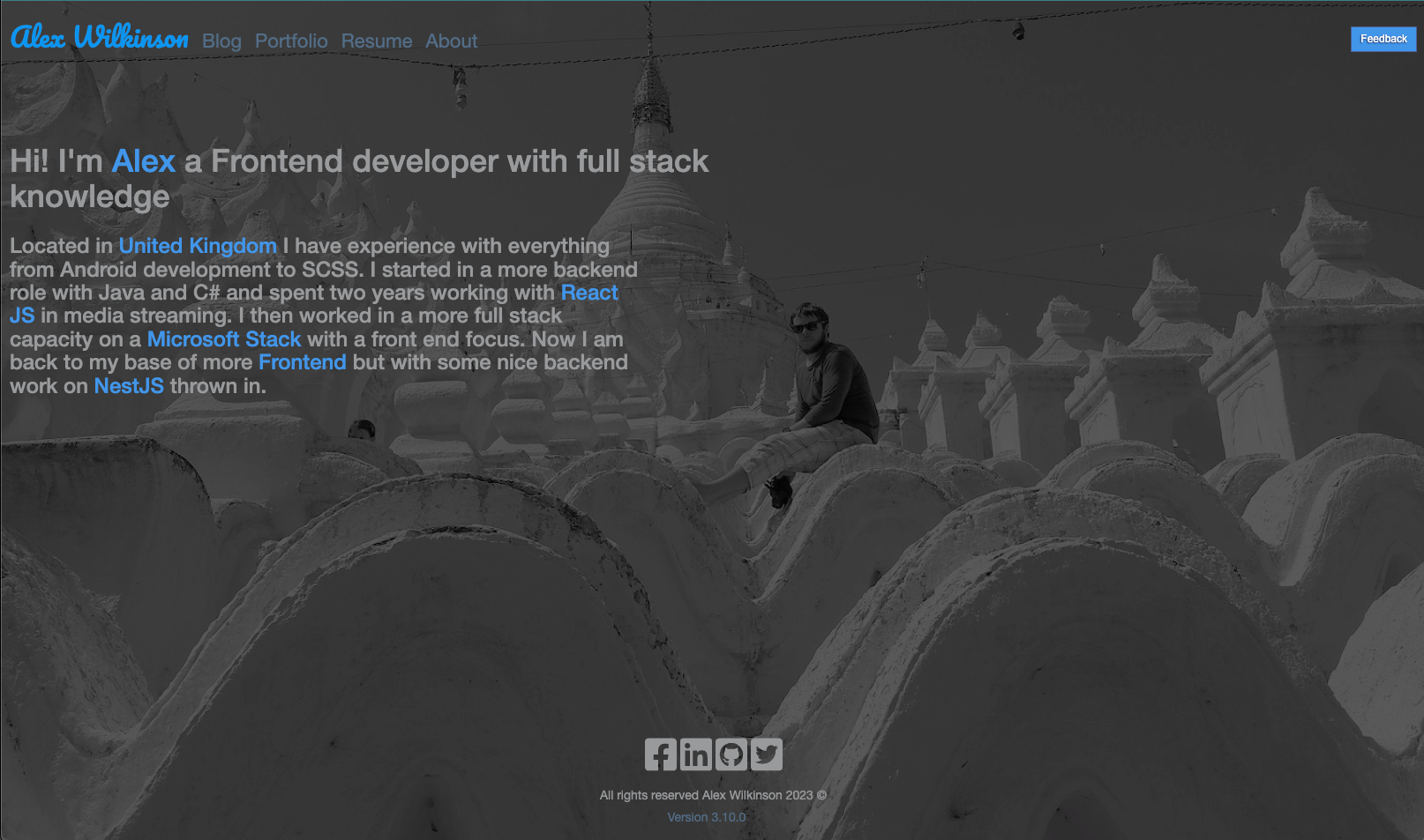
I don't feel there is much really wrong with it at this point, however I do believe it may not accurately reflect my personality and with the fact it was built quite a number of years ago it also made sense to rebuild it, in some cases simplifying parts of it and streamlining aspects of it.
The Design
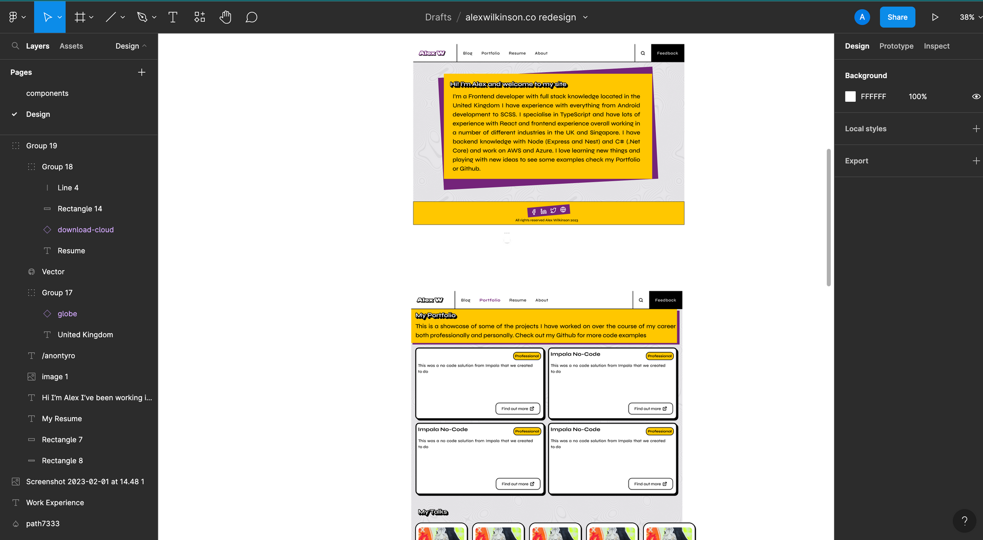
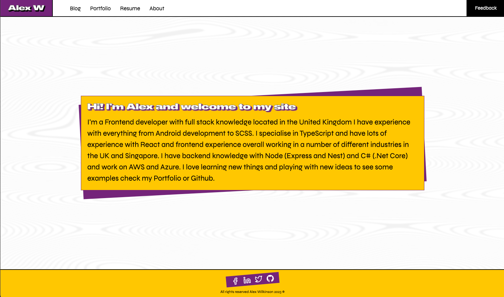
This time I started with wanting to be more involved in the design and feel of the site and with an understanding of what I wanted in my head I spent sometime looking around in Figma for some different components and libraries people had developed and worked on. I knew I wanted something that was going to be much more colourful and following a somewhat brutalist aesthetic so that gave me a good place to start and before too long I found a few different libraries and designs that I would start adapting into my own design.

Figma is a tool I have been rather interested in for sometime, I have avoided it because it is a bit tricky to use and is quite intimidating going into it. What is nice is there is a lot of information online and after a bit of playing around I was able to build out some designs that gave me what I needed to go ahead and start implementing something.
The Strategy
Previously when I have built out my site I have used it as a somewhat central jumping off point for a lot of different technologies I have played around with. Previously my site had a rather complex backend that would link to GitHub and GhostJS via GraphQL to serve the data to the frontend, it was over-engineered for sure but it was also a testing ground so it didn't matter too much. The only problem was, with aspects more tightly coupled it was hard to just update the frontend without touching on other areas, this was a key consideration moving forward.
As I had a few different problems previously I decided it was best to keep the frontend side rather lean and use NextJs, once more, but this time hosting it via Vercel cloud which allows for rapid development and deployment with very little effort. It is a great platform and one I quickly fell in love with when working at Impala as we used Vercel for the frontend and I quickly saw the benefits of it. This also allows me to totally decouple the frontend NextJs app from everything else which will make it easier to maintain and update each section on their own.
I do indent to build out my own backend service using NestJs with the aim to create a basic gateway and then more micro-services to allow for more complex backend processes but as that would be largely just for playing around and testing technologies it does not block or slow down my site development.
Again for the blog side I am using GhostJs which I have now updated to version 5 and believe Ghost still provides a lot of flexibility and power that is another thing I do not want to build myself.
The Technology

The key technology that I have used in this redesign is intended to help speed up and simplify the frontend of my site greatly and allow for a more flexible platform that is not coupled too heavily to other aspects that I may be working with.
NextJs + TypeScript
After using NextJs again at Impala and seeing the improvements and enhancements Vercel have managed to do to the framework it made a lot of sense to keep using it and of course with TypeScript as this is pretty much the de facto way to write JavaScript applications now.
GhostJs
I liked Ghost when I first used it many years ago and still like the platform a lot. It has continued to evolve and change with the times and proves a great open source free platform to host written content. As it is fully headless as well it is easy to integrate into other apps and helps take away a lot of the pain and time needed to build out something that already exists.
Vercel Cloud
As they have a hobby tier which is free and integrates perfectly with GitHub it made a lot of sense to go with this. It simplifies the deployment process greatly and has various analytics out of the box.
The Implementation

When building on the new site after I got my basic designs together I wanted to get something up and running quickly, it is always important to get the ball moving and something into production fast and continue to iterate on it. With this in mind I setup a basic NextJs app on my Github and connect it to Vercel to get the thing building and the basic pipeline in place.
Next I built out the basic homepage and initially using some static text values managed to implement the design I was after. I did have to work on it a bit more when I considered more the mobile experience and how it should look on wider screens but this part was probably the largest amount of work as it built out a lot of the theming and design for the navbar and footer along with the text and blocks that would largely carry through to the rest of the site.

I then moved onto the Portfolio page and as I wanted a lot of the content to be served externally I decided to just use a content branch in the GitHub repository to store the static JSON files. I like this approach as the data is going to be rather static but may require small updates overtime, this becomes annoying to deal with then you need to redeploy everything to change a few words here and there, but I also didn't need the complexity of having a full database which would require a lot of additional work for no benefit. As GitHub is a highly available site I don't see there being much issue in hosting the data there for this case.
Creating the schema for this data did take sometime as I wanted it to be flexiable and not really tied to my own site in any meaningful way. This was of course a phase that was over-engineered for the requirement but I liked the challenge and although did require quite a lot of additional work I believe it was a good exercise that has worked fairly well in expanding the data to the other pages as well.
The Portfolio page has changed quite a bit from my previous site and does still have a bit more work required to bring in the talks along with hooking the project to these ghost posts which I came to the conclusion would be the best outcome as Ghost has a good editor and is easy to use and update making for a better user experience. It also has a robust API to allow for the data to be moved to other apps as well fairly easily which is how this posts are being hosted on my site.